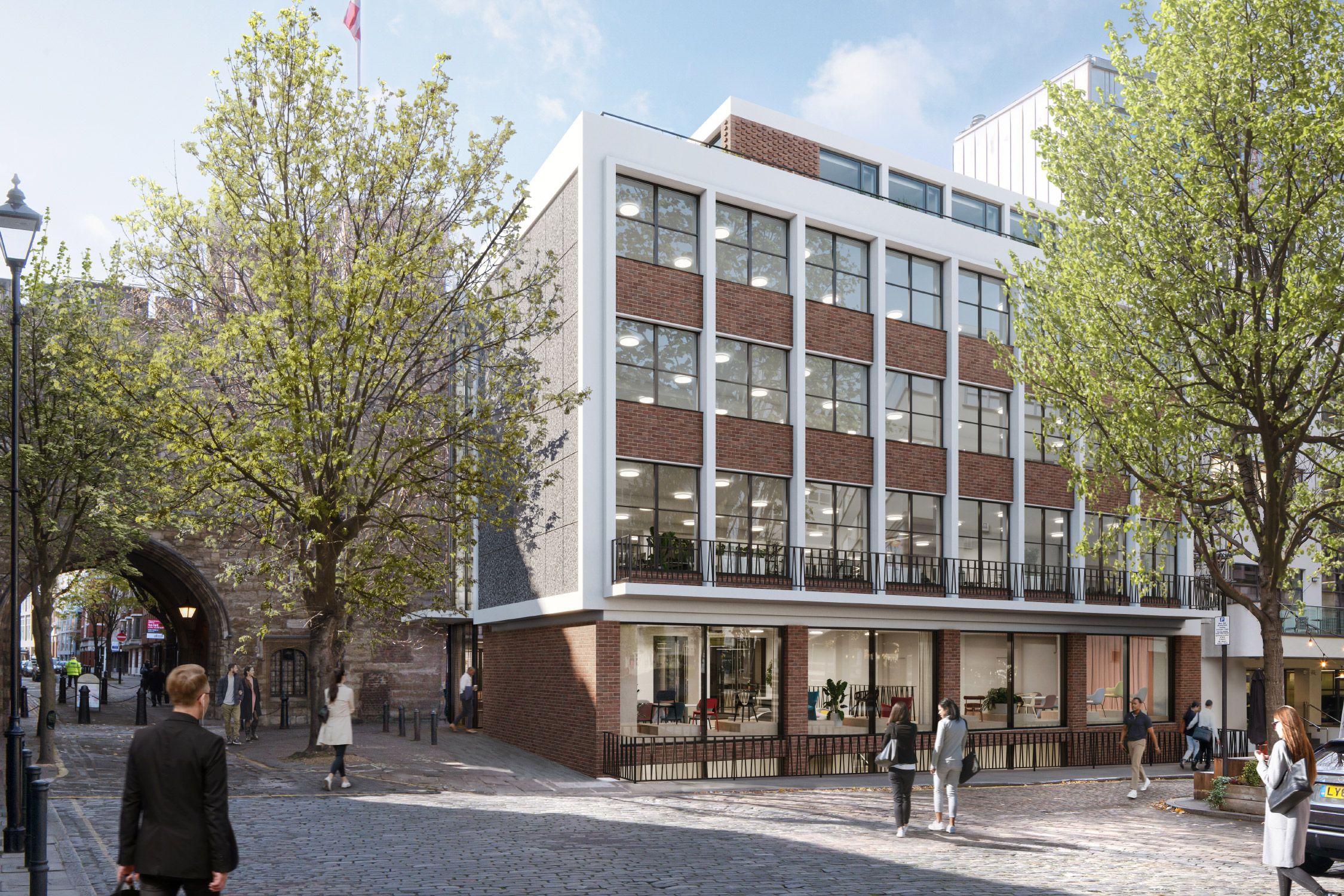
A collaboration between developers Nuveen and architects Buckley Gray Yeoman, The Sans is a flexible 38,000 sq ft workspace, driven by core values of accessibility and sustainability.
The Brief
Managed by workspace agents Compton, responsible investors Nuveen and forward thinking architects Buckley Gray Yeoman, The Sans is a classic modernist office building re-imagined for a new era. We were asked to develop a visual identity that would reflect the values and ethos of the building, and build on a mission that supports the promotion of wellbeing, environmentally sound regeneration and forward-thinking ideas.
The Solution
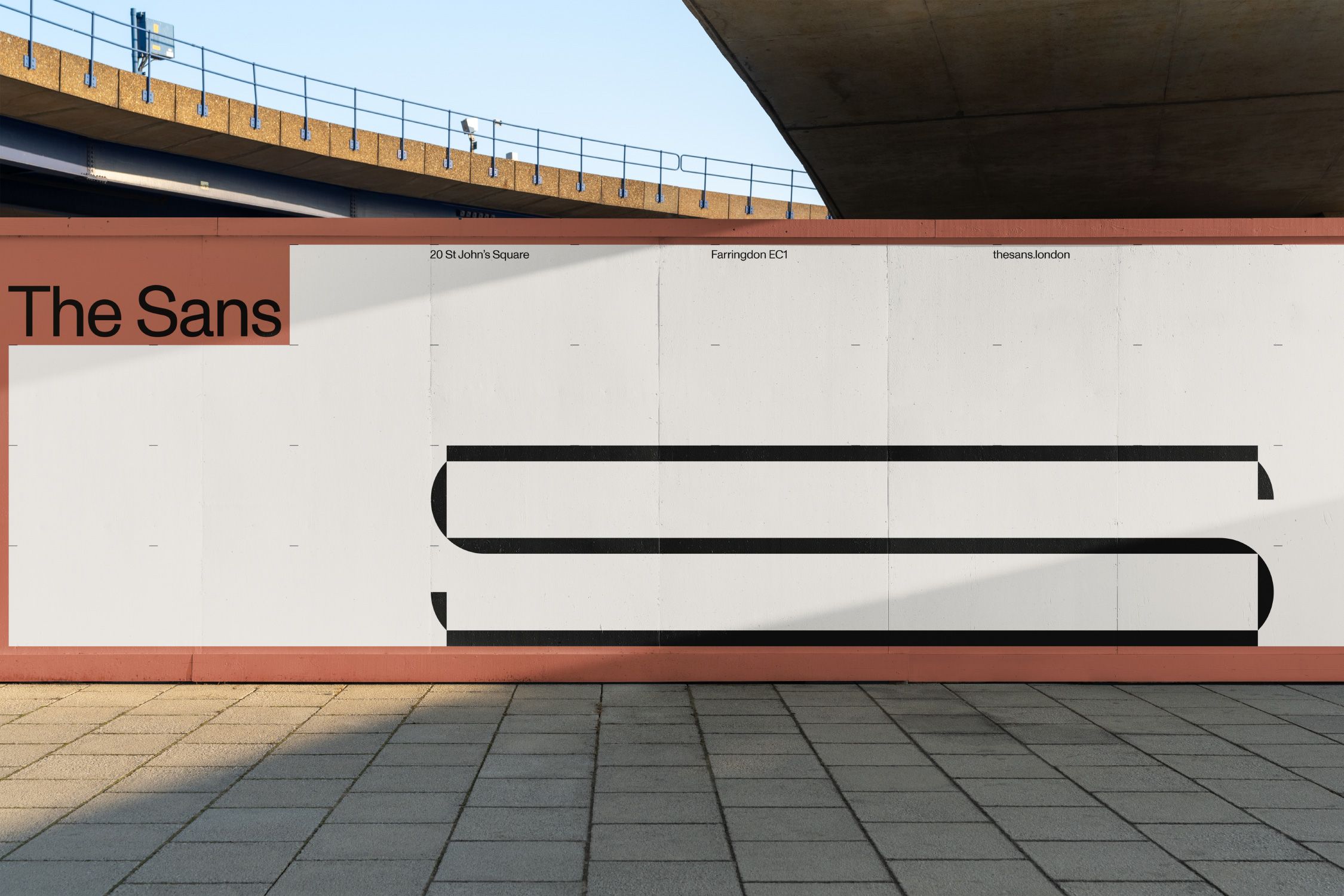
The identity system we developed was inspired by the heritage, and architecture of the building. Rather than mimic minimalist perfectionism, we gave the modernist features of The Sans a contemporary twist with a flexible identity system, using the narrative of the building as a guideline. A custom grid echoed the building’s facade with an unconventional use of space; tightly-packed text contrasted with heavy use of white space.
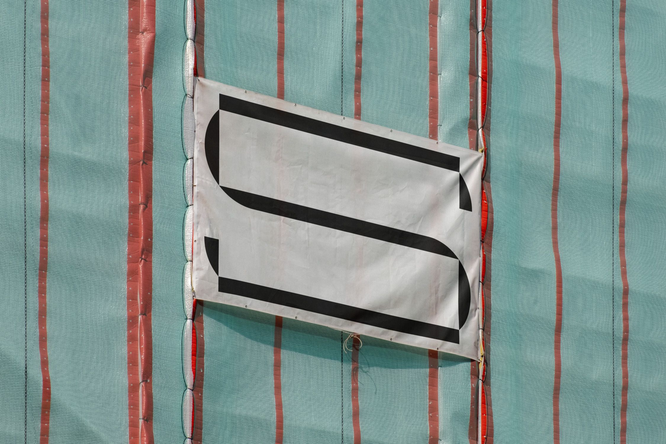
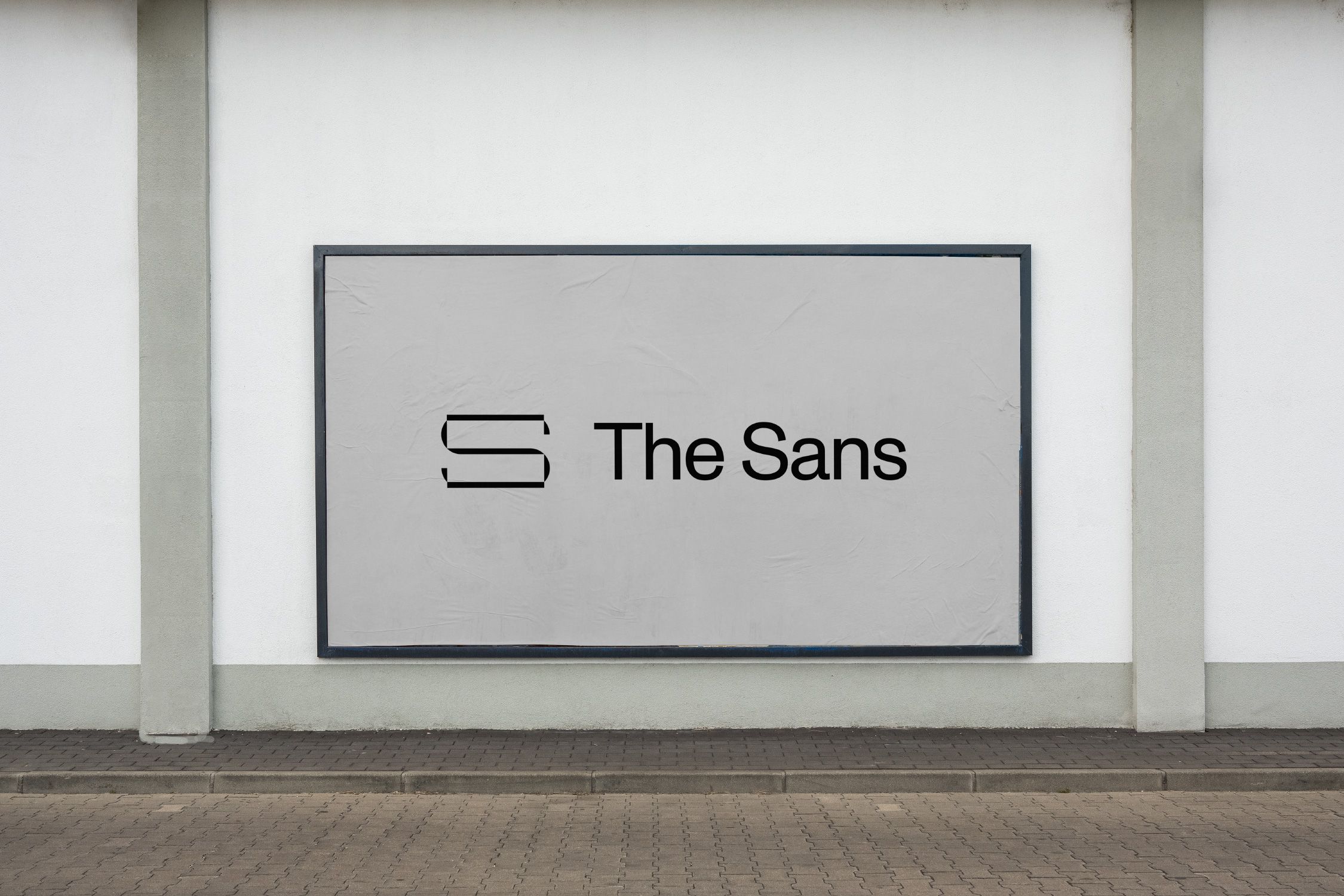
Taking inspiration from the architecture, the corners of the responsive ‘S’ logo hint at the building’s structural form. The choice of Dinamo’s Monument Grotesk reflects the buildings unrefined, raw aesthetic.
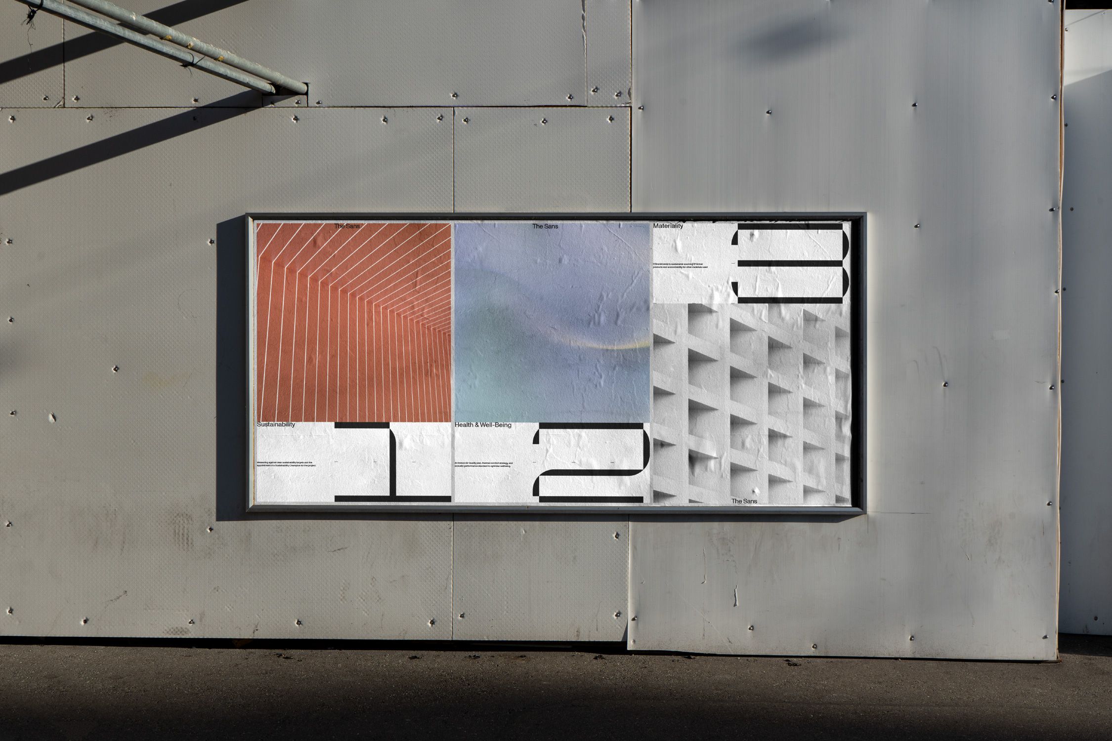
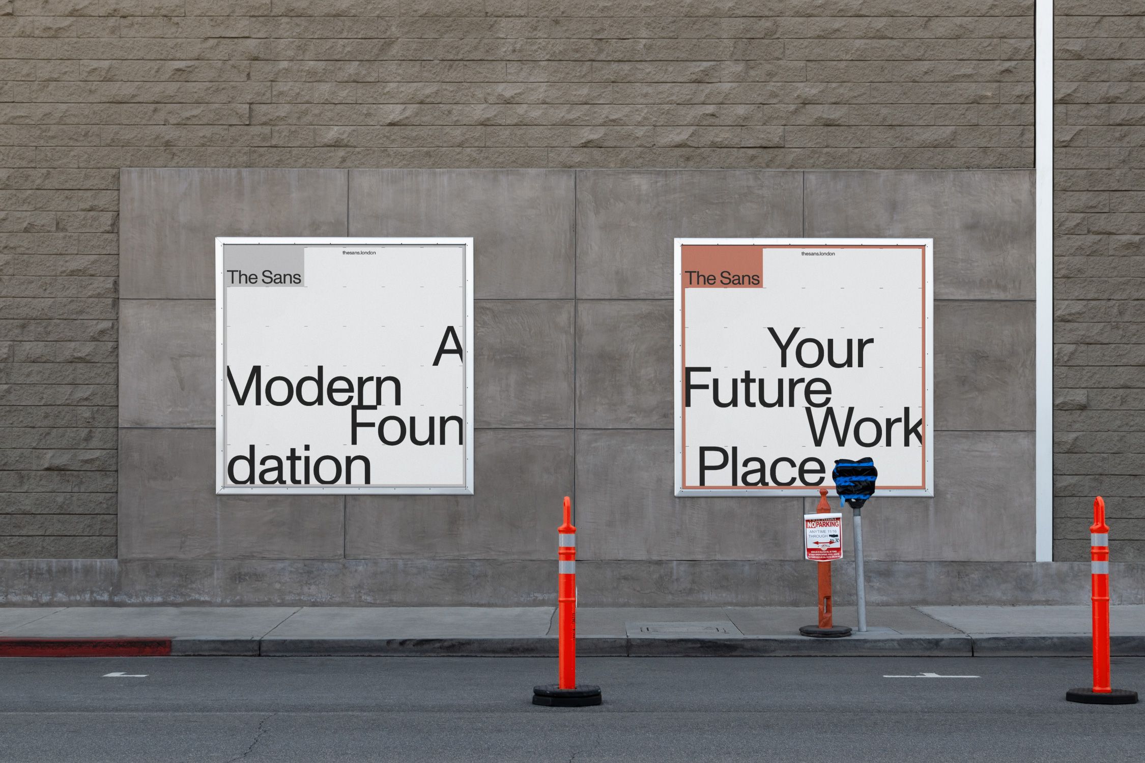
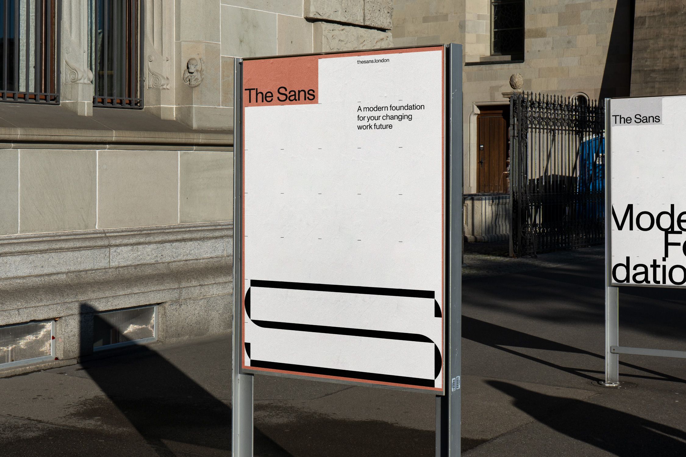
The colour palette is influenced by and built from direct reference to the material qualities of the building’s exterior: brick, steel and white concrete.
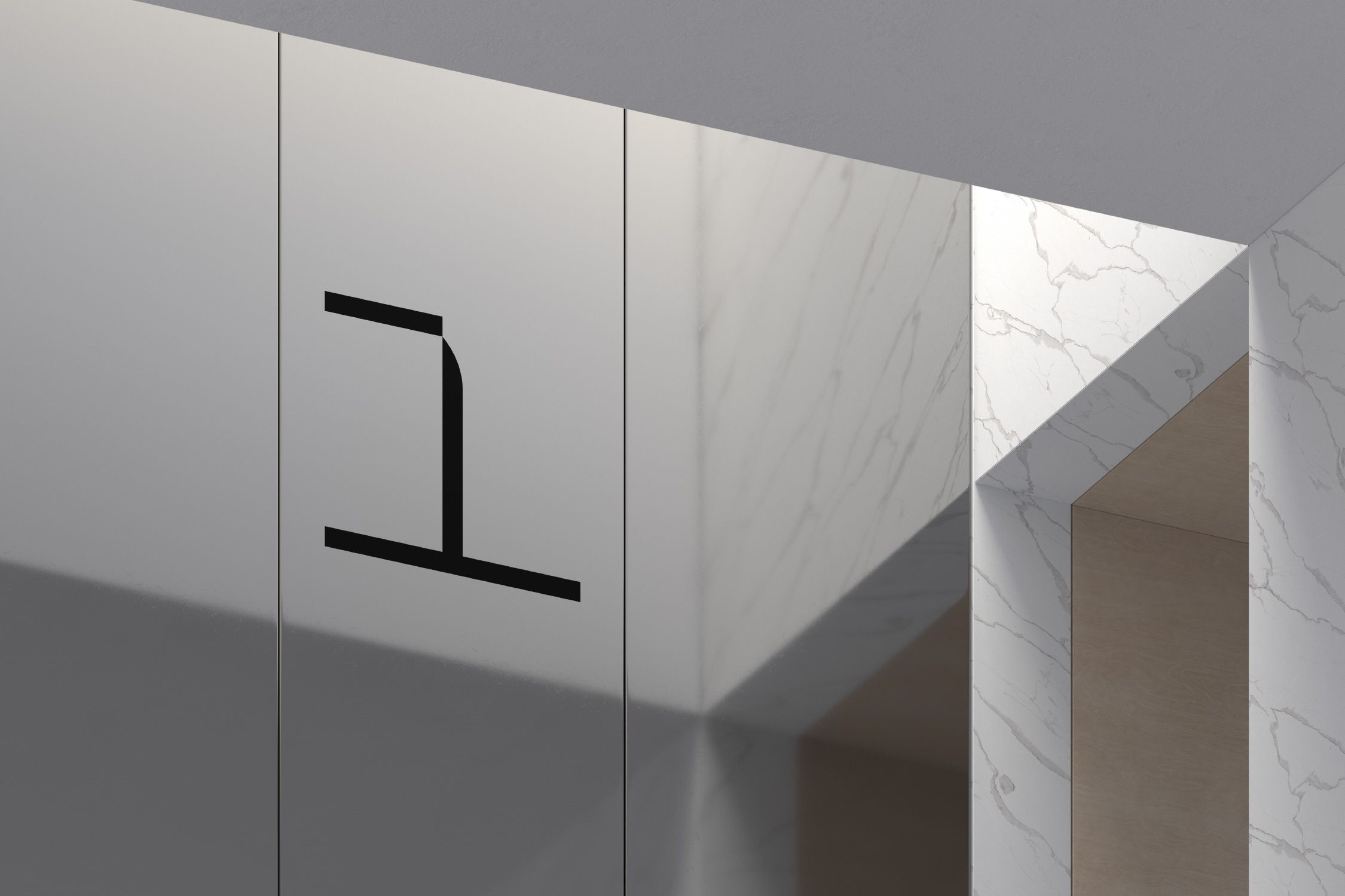
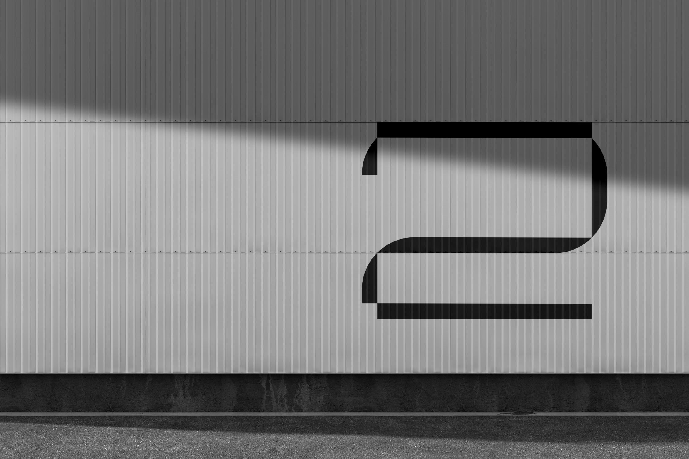
A set of bespoke numbers has been designed following the same structure and graphic language as the main logomark.
Related Projects Related Projects