In a landscape rich with cliches and jargon, boutique firm Dickson Minto wanted to step back and stand out, to more effectively communicate their status as leading international corporate law practitioners.
The Brief
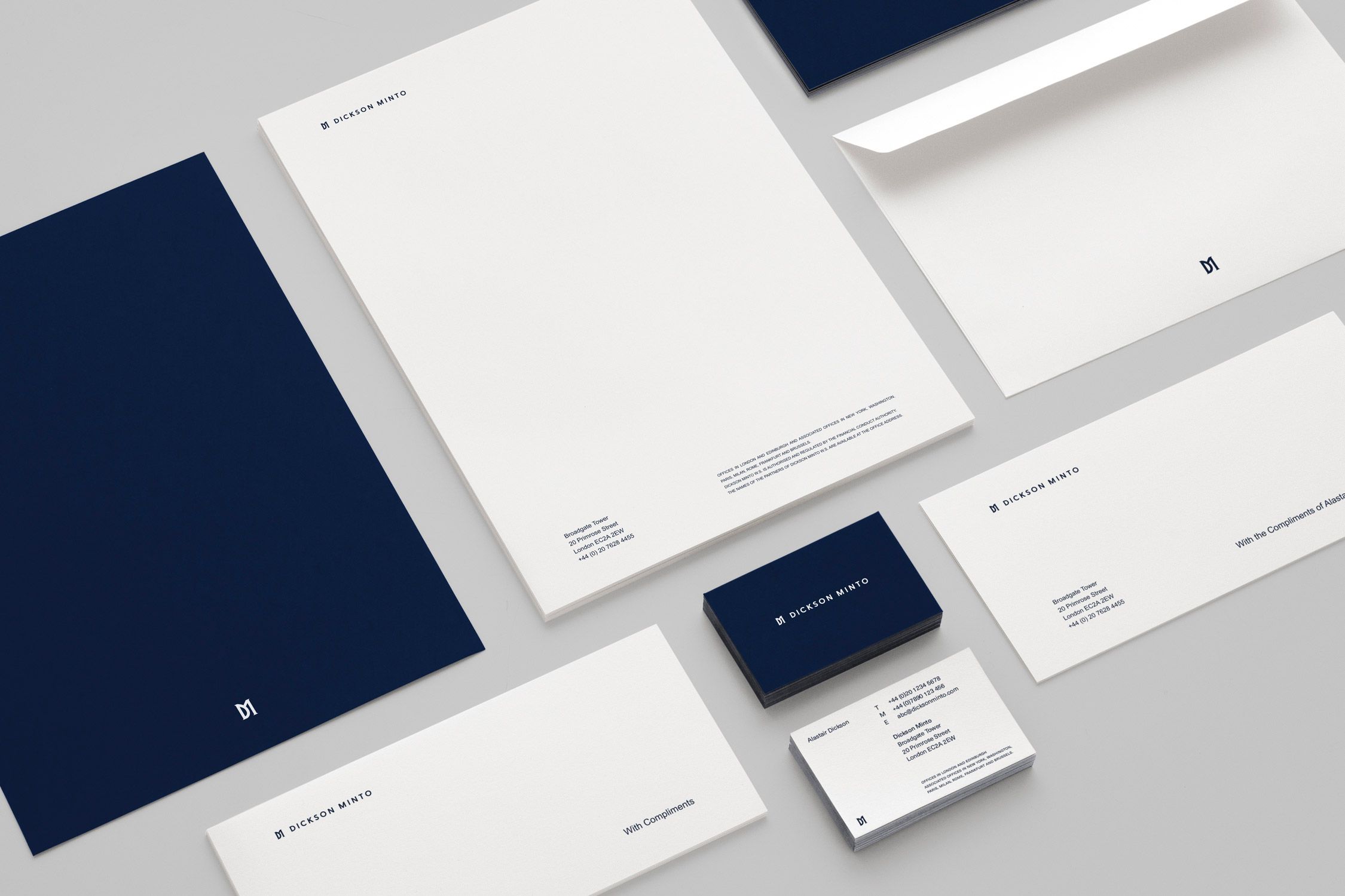
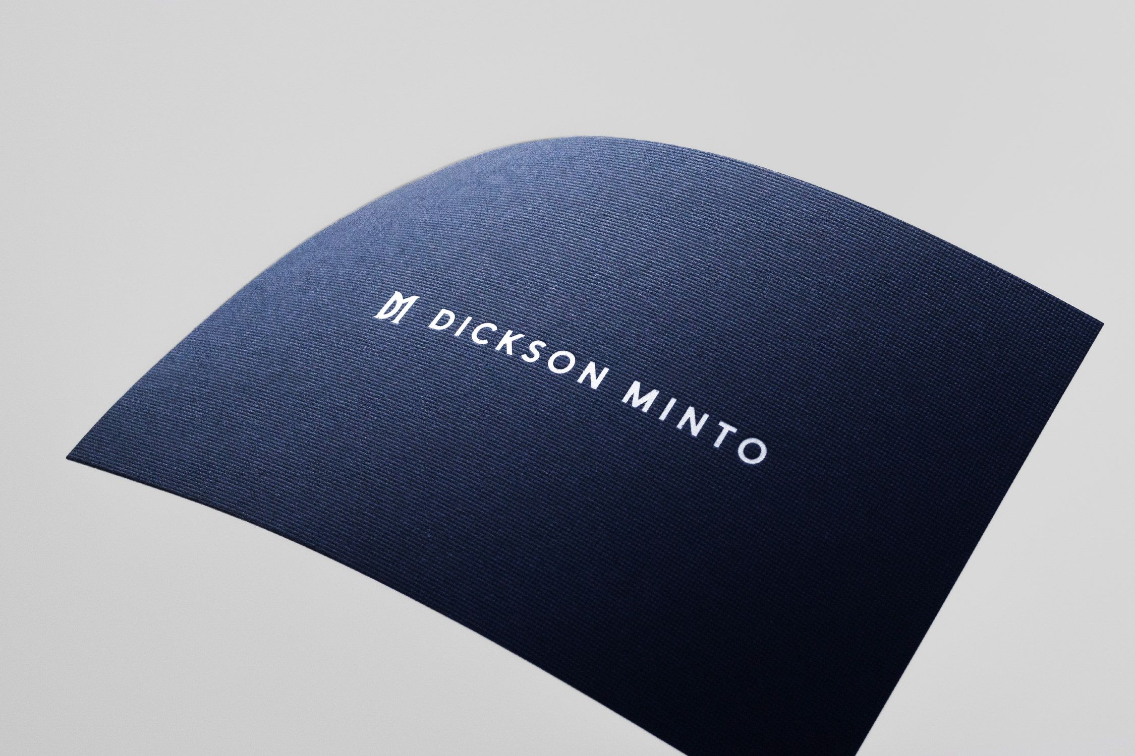
The Dickson Minto brand required an update. Its expression, across all channels, was outdated and lacked the premium cues that the marketplace it was competing in was rapidly adopting. From tone of voice and brand values to printed collateral and the firm’s digital platform, we needed to elevate the visual landscape and emphasise the specialism and focus of the team.
The Solution
We set a new standard for visual and verbal branding within this highly competitive market, losing the cliches, stripping out jargon, and mirroring the considered language of corporate law. In collaboration with the management team, we redefined the brand identity, creating a modern update to the logo and a contemporary graphic language for internal and external communications.
Client
- Dickson Minto
Industry

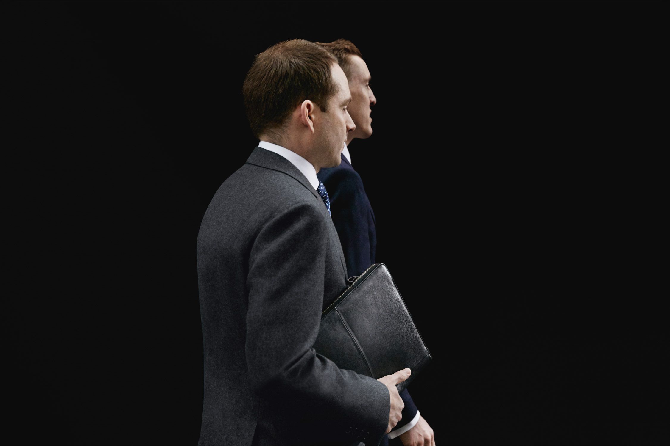
To effectively portray Dickson Minto’s brand values we art-directed a series of photographs shot by Mark Sanders and Aaron Tilley, shifting from cliché to a more confident, putting people and the workplace first.