Ikon work in a highly competitive marketplace: the design and development of workspaces. As a new and growing company, Ikon needed a fresh identity that mirrored their ambitions and future trajectory.
The Brief
What Ikon came to us for was a new brand identity that would communicate quality and competence. A brand that would attract like-minded people who care about the details and want to spend money on well considered, high quality offices that reflect their brand values. Ikon’s new identity also needed to set expectations of a premium service, and communicate the importance of trust, collaboration and process.
The Solution
The identity reflects the importance of Ikon as a trustworthy partner, and a collaborator across disciplines. The addition of the + sign highlights collaboration, as well as the way that Ikon goes the extra mile across detail, finish and execution in their work. Art direction was another factor in creating a distinctive visual approach to differentiate them from their competitors, with a focus on warmth, details and people.
The Client
The team at Campbell Hay have transformed our brand and given us a unique identity that is true to our ambitions and values. Not only is their end product fantastic, but their pro-active and collaborative nature made what would be a very stressful process genuinely enjoyable. Campbell Hay are an extension of our own business and we enjoy continually working together.
Mike Garrett
Managing Director, Ikon
Client
- Ikon
Industry
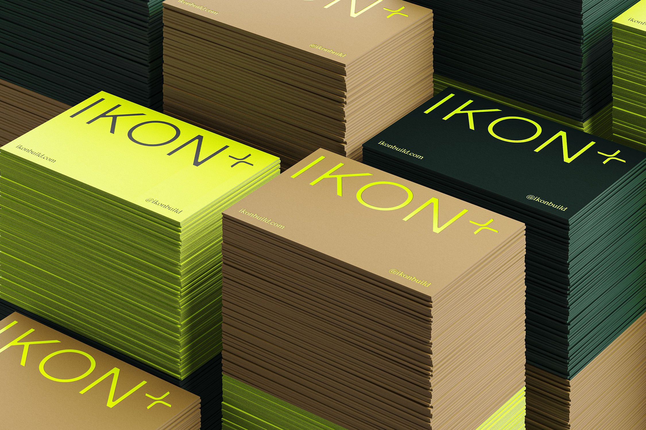
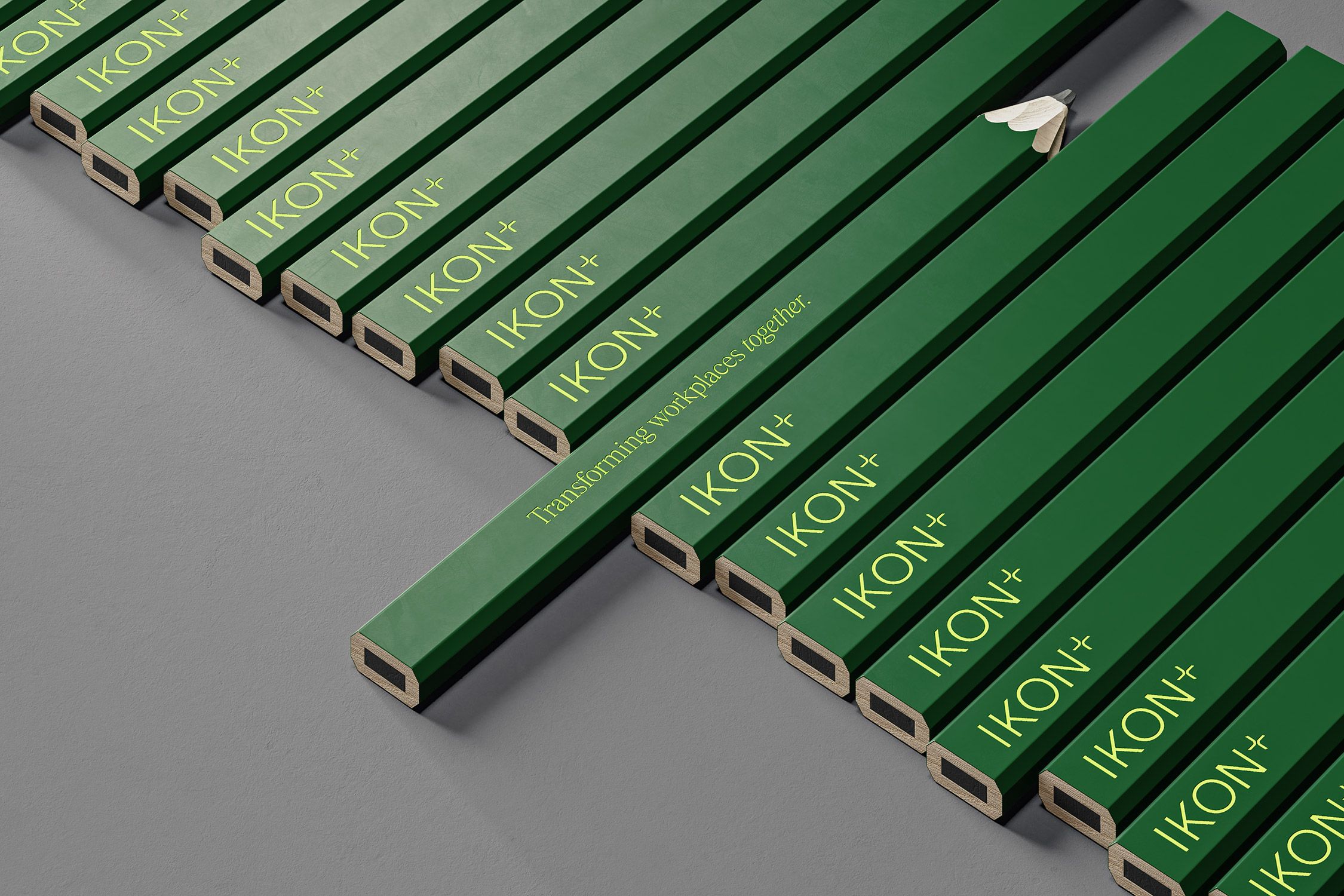
Reflecting Ikon’s collaborative approach and meticulous attention to details their new logo incorporates a + sign.
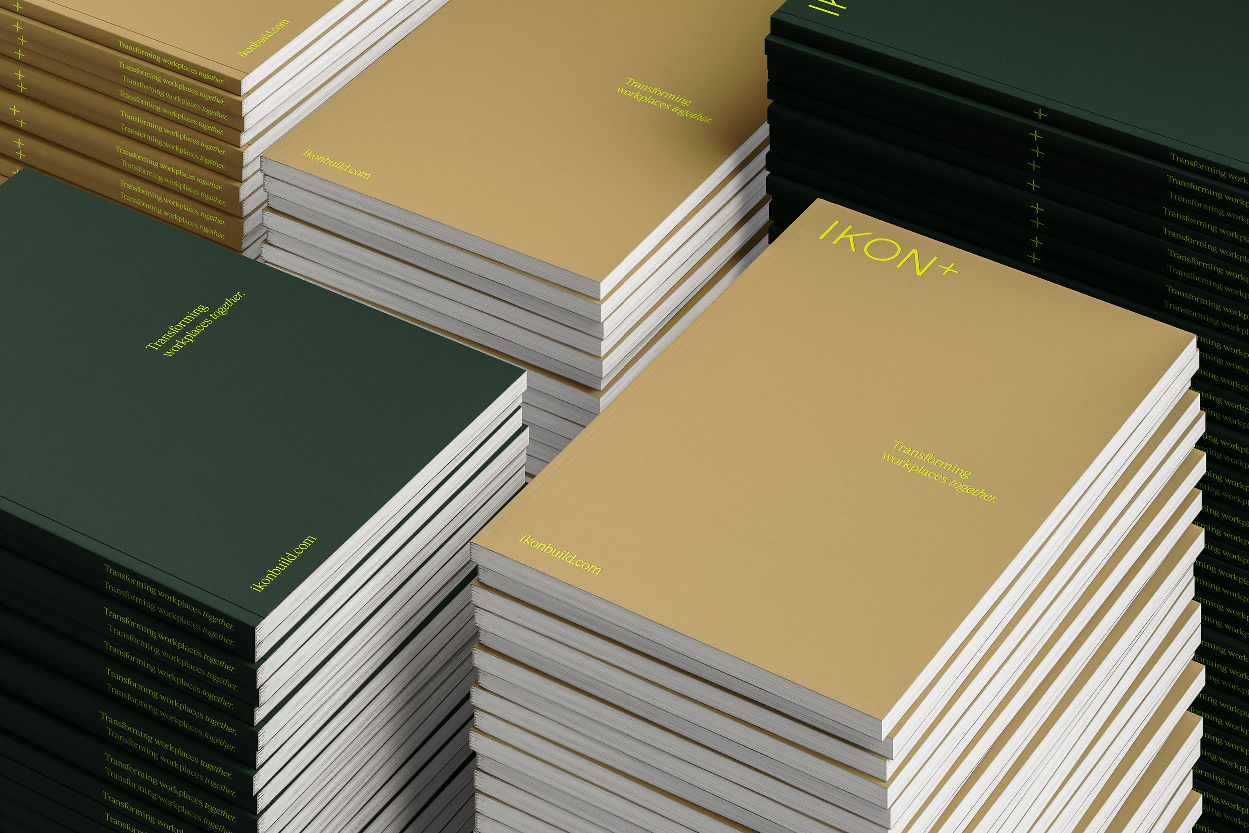
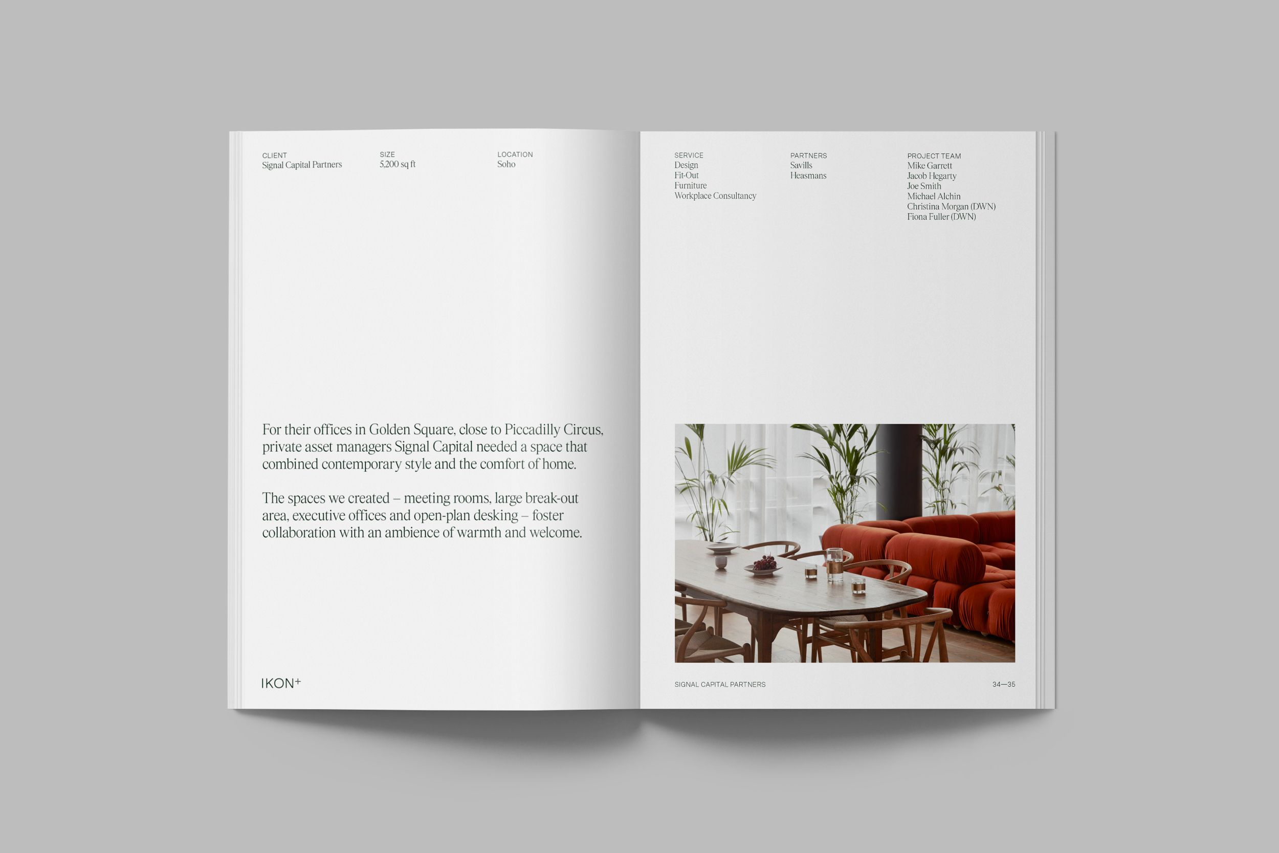
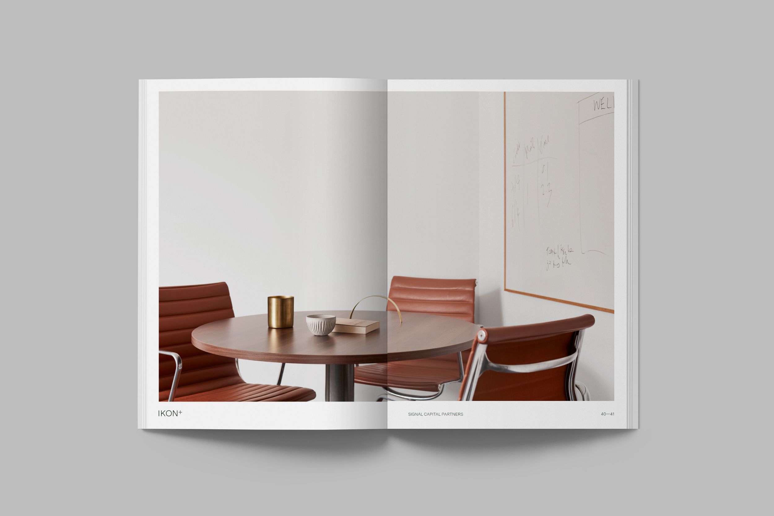
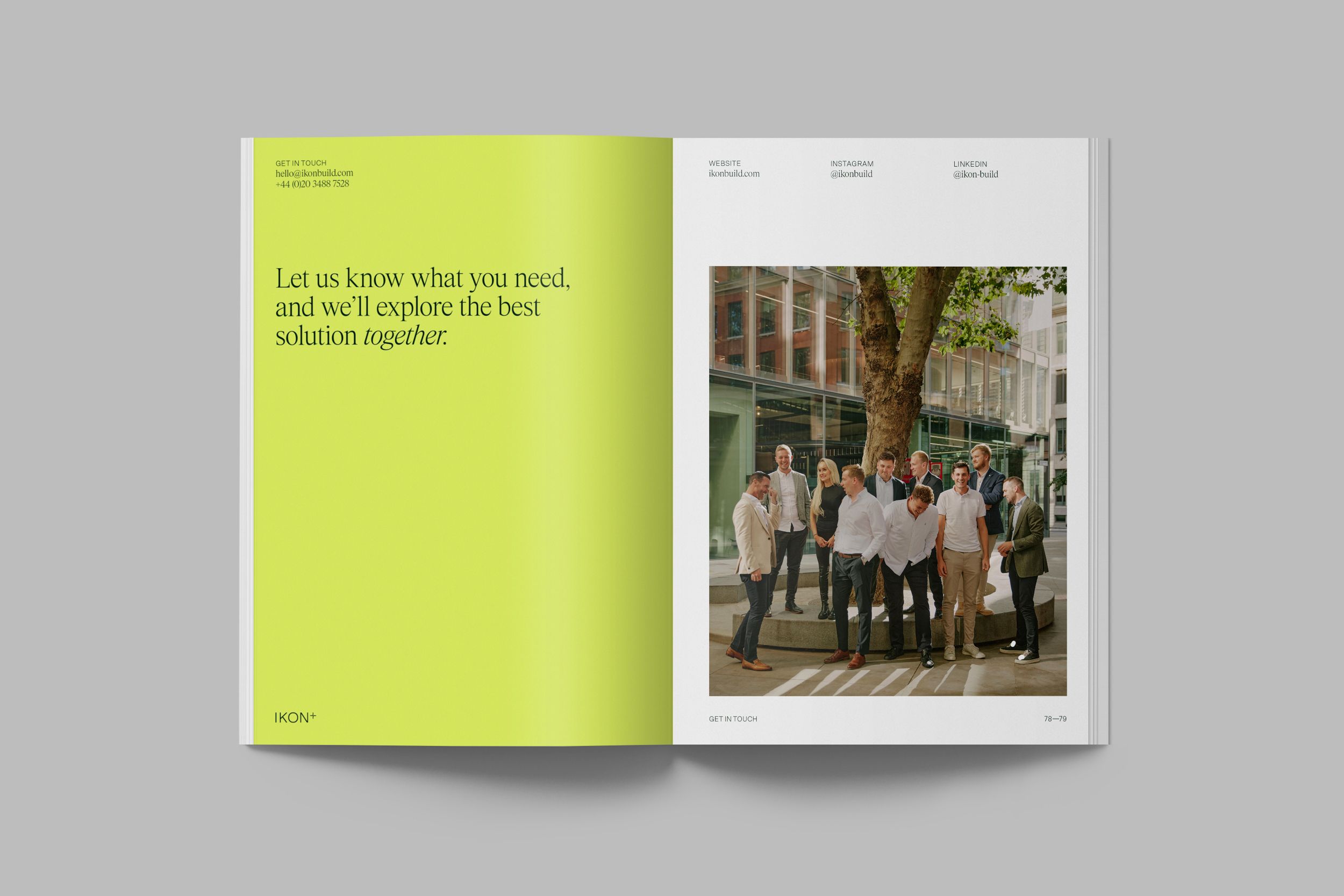
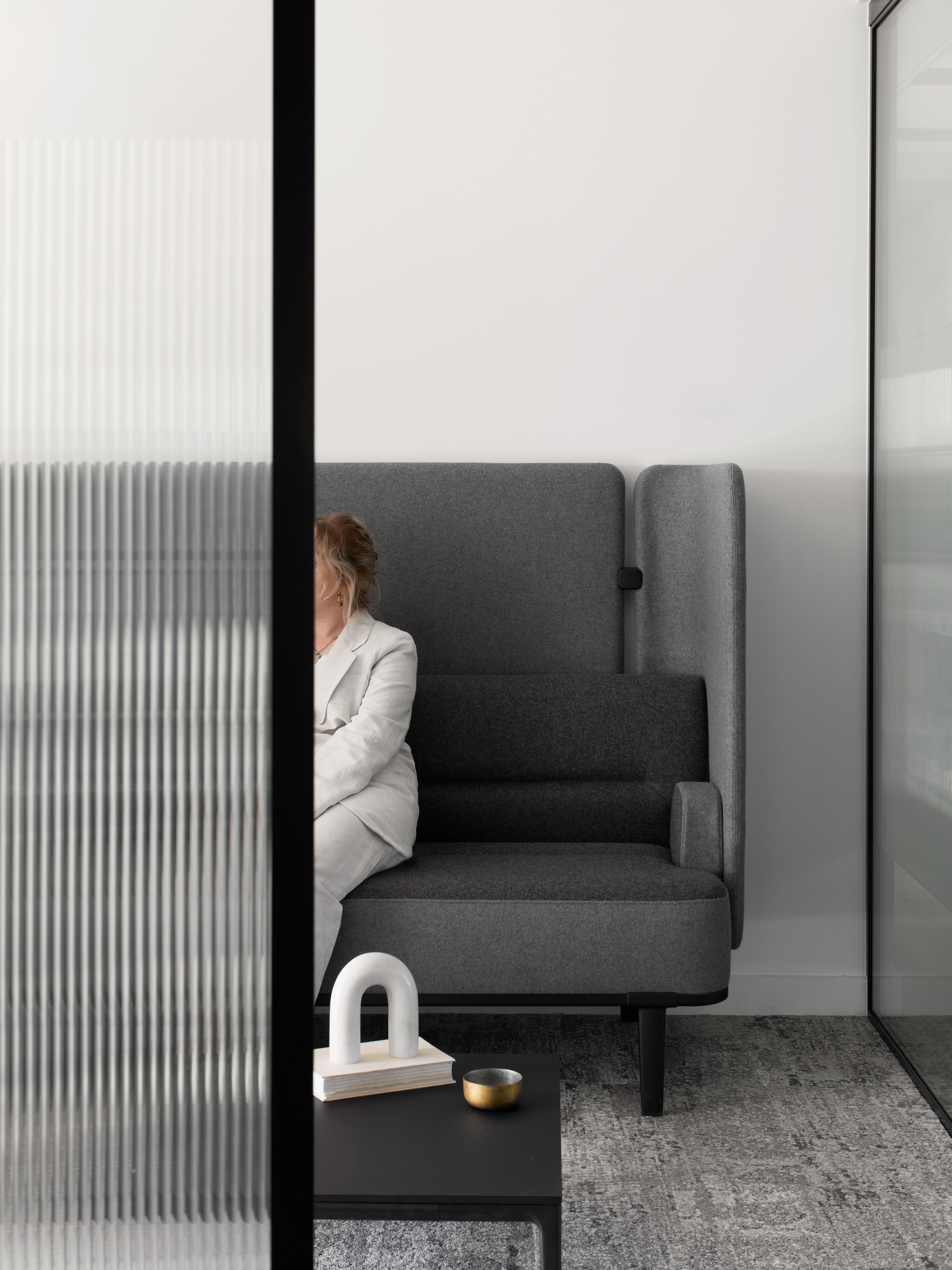
The brand’s art direction puts a focus on people and process, highlighting Ikon’s extensive knowledge and deep understanding of the construction industry, and their people first approach.

