Wrenbridge shapes the landscape of progress; creating ecosystems where enterprise flourishes and innovation finds its foundation. The rebrand gives the company a people-first, future-focused identity, adding warmth and clarity to how they present the built environment.
The Brief
Wrenbridge needed a rebrand to better reflect the best-in-class buildings they develop and the work it enables their customers to do. The challenge was to evolve an identity rooted in buildings and industrial environments into something warmer, more human, and forward-looking. The brief called for clearer, more confident communication — expressing progress, a human-led approach, and a commitment to bringing positive change.
The Solution
We created a contemporary identity that brings clarity and warmth to the Wrenbridge brand. The original logo was simplified by removing the box container, giving it a more streamlined and elegant presence. We introduced a refreshed colour palette with more distinctive tones and refined the typography to feel consistent, approachable, and editorial. The new brand copy emphasises positive change, momentum, and the human impact behind every Wrenbridge project.
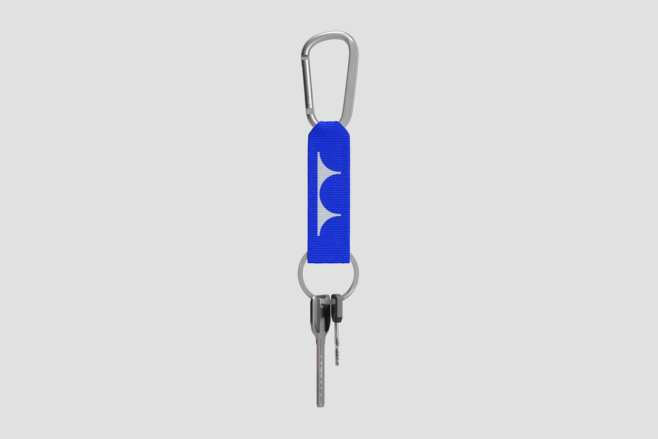
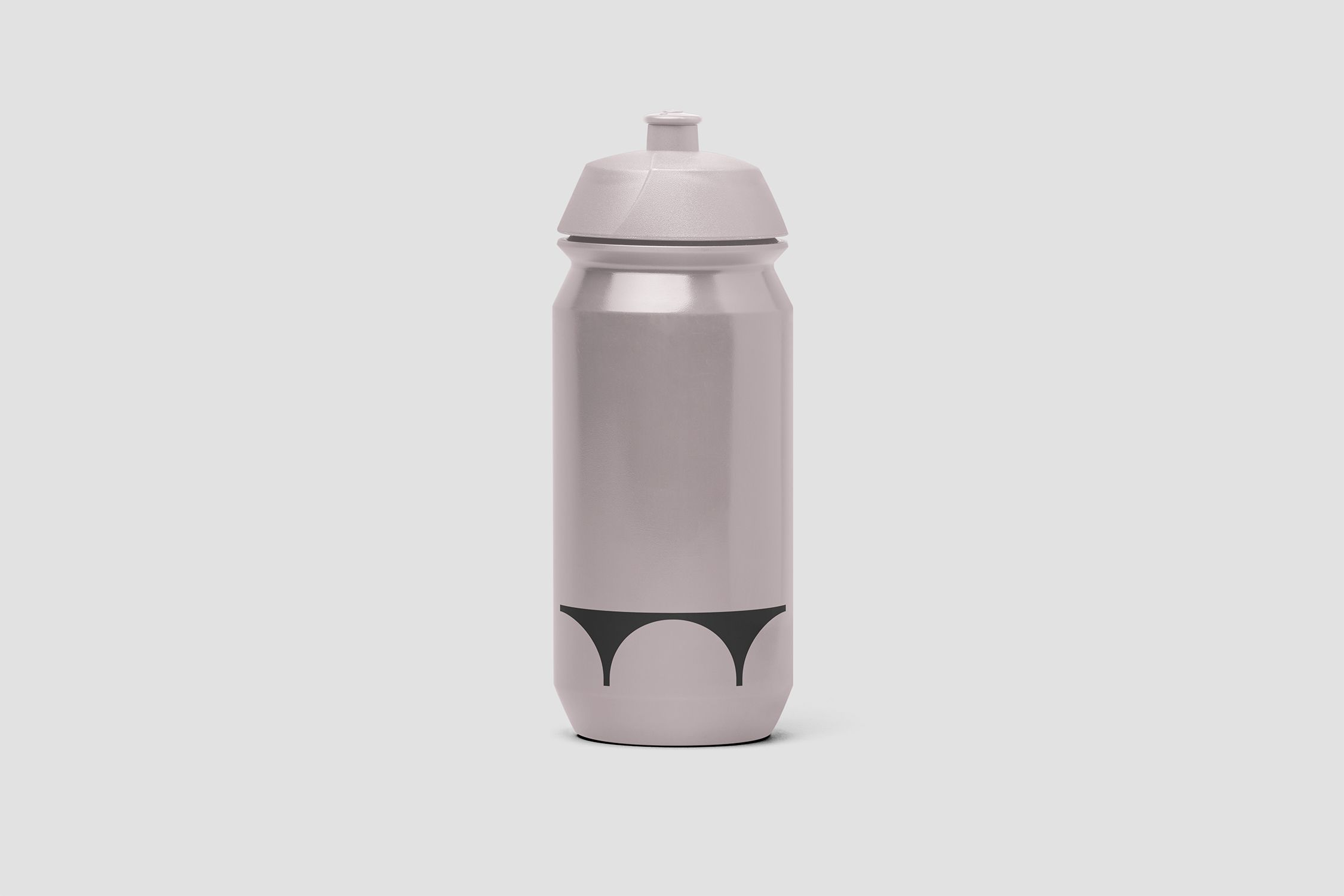
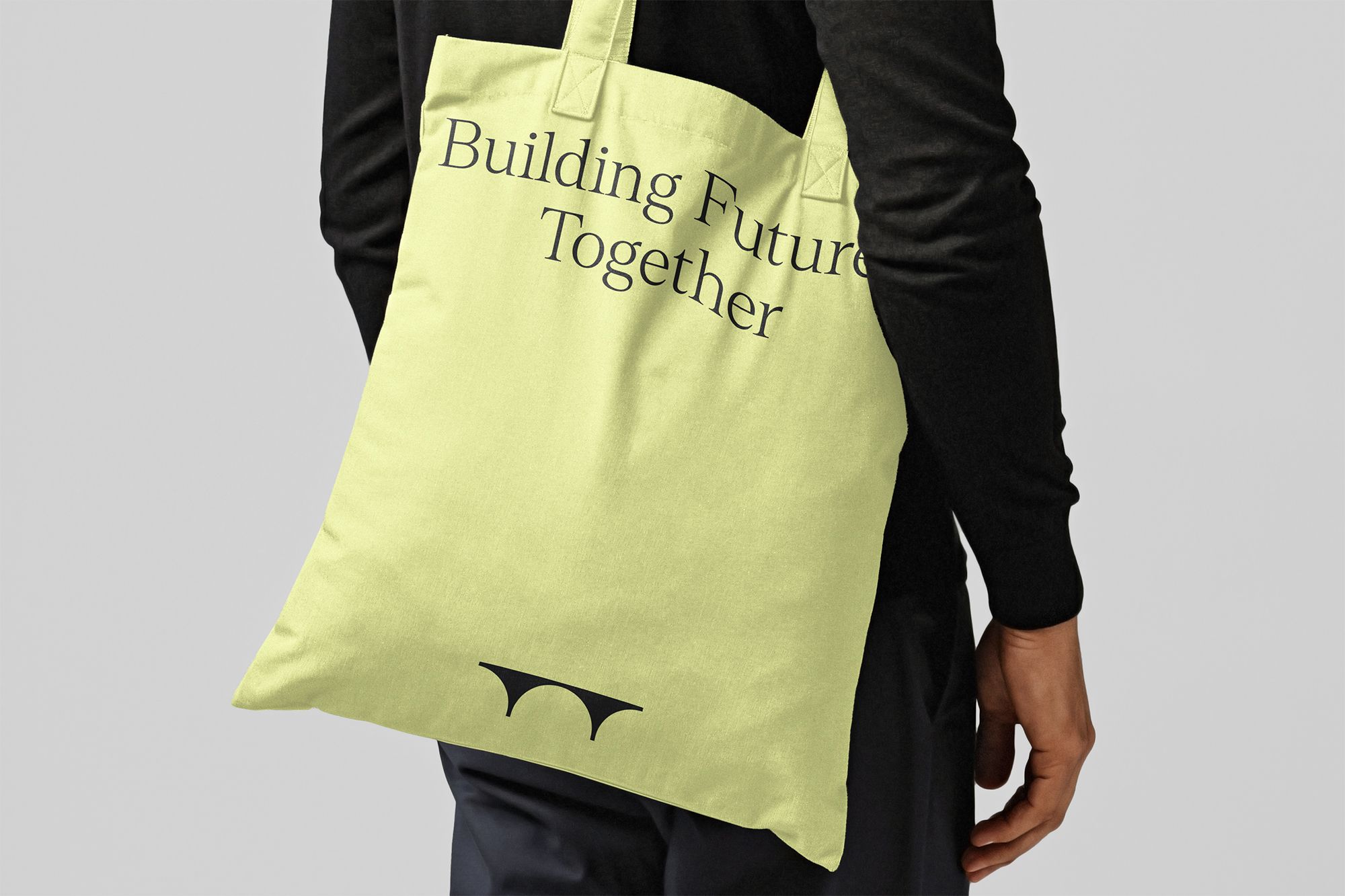
By removing the square box and refining their original logo, we created a simplified design that gives greater prominence to the bridge icon and its link to the Wren Bridge in Cambridge.
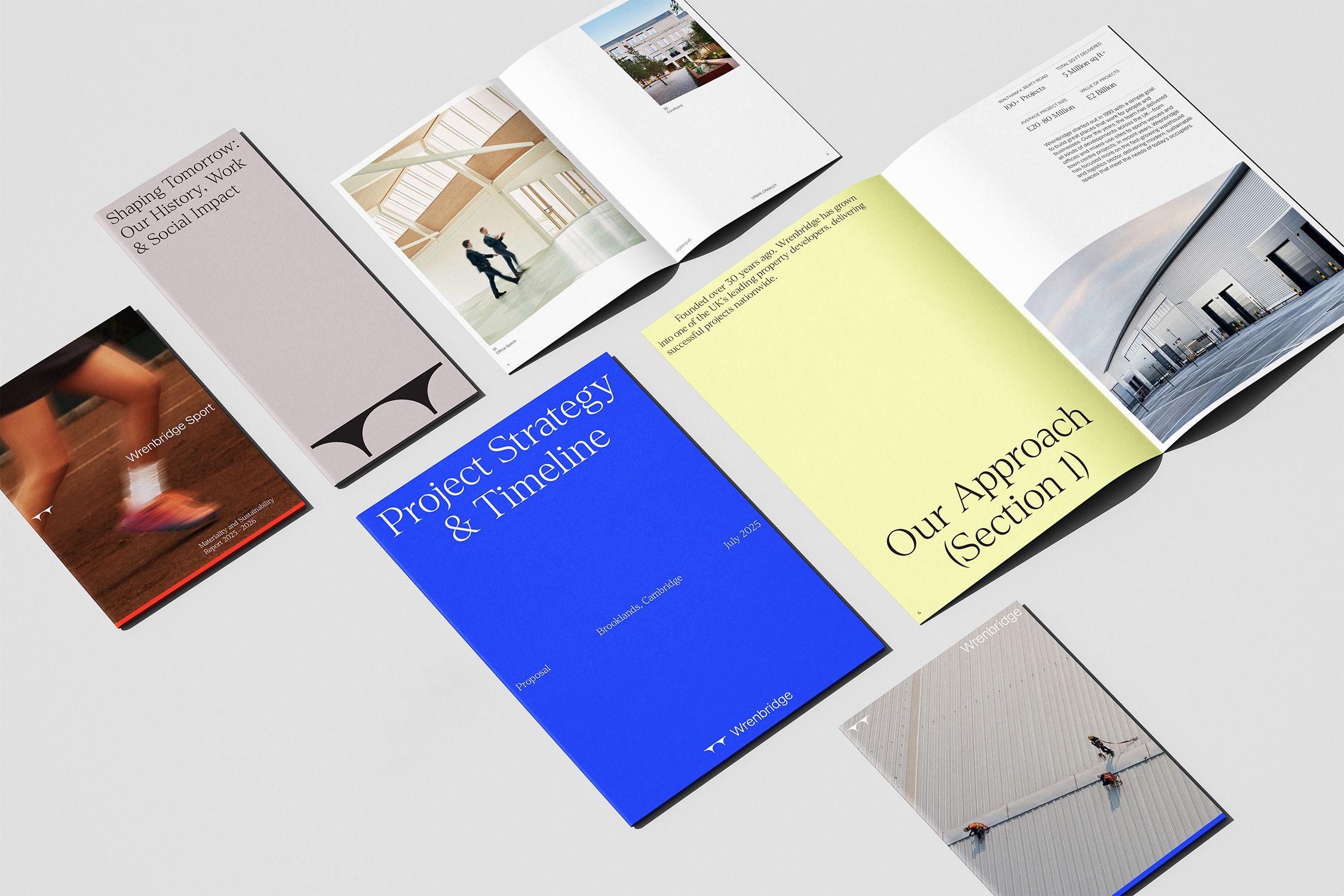
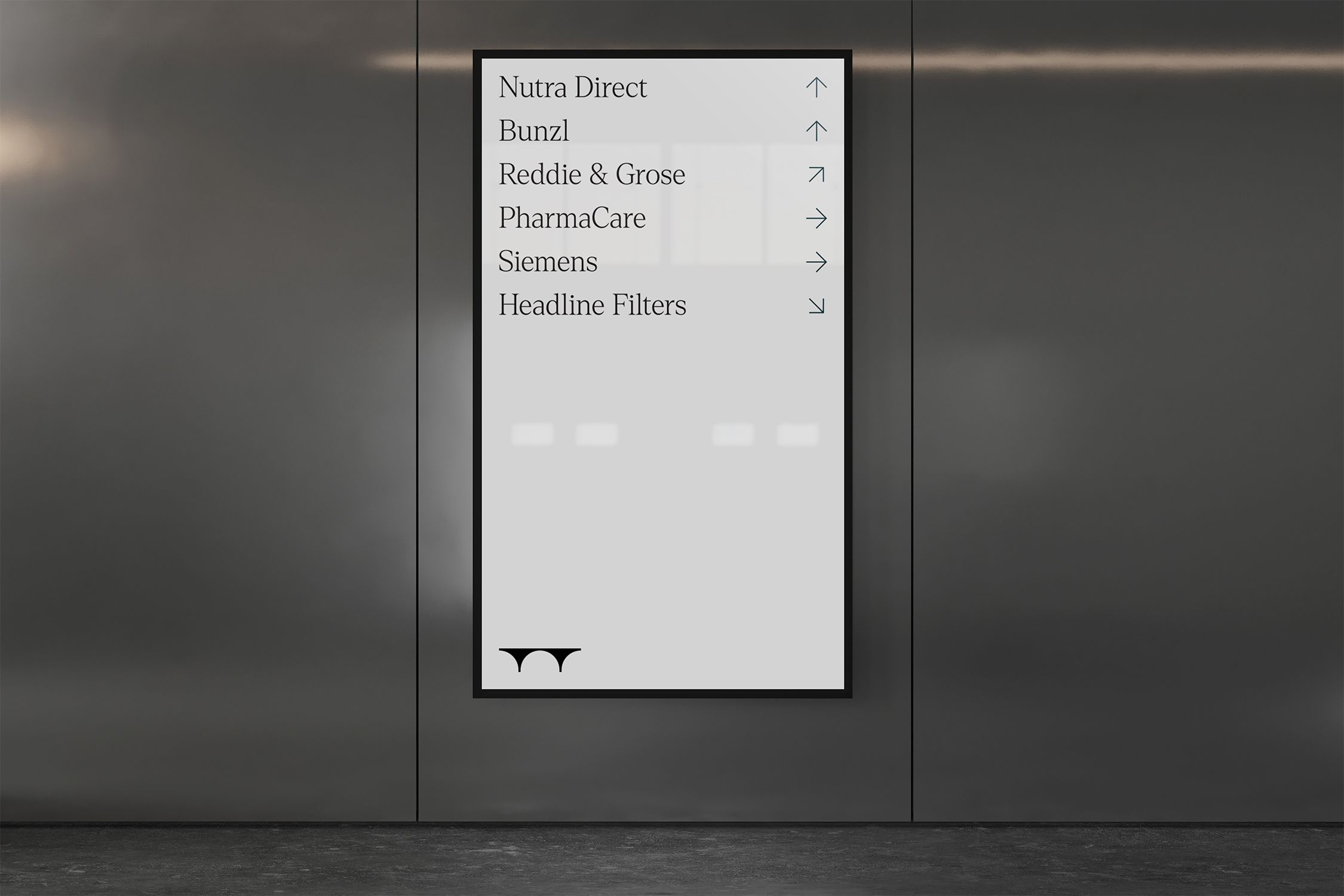
The new brand elements introduce fresher, more distinctive colours and refined typography, bringing greater clarity and consistency across all communications.
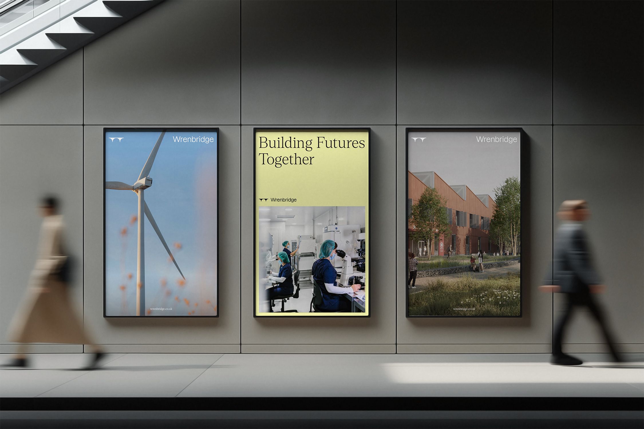
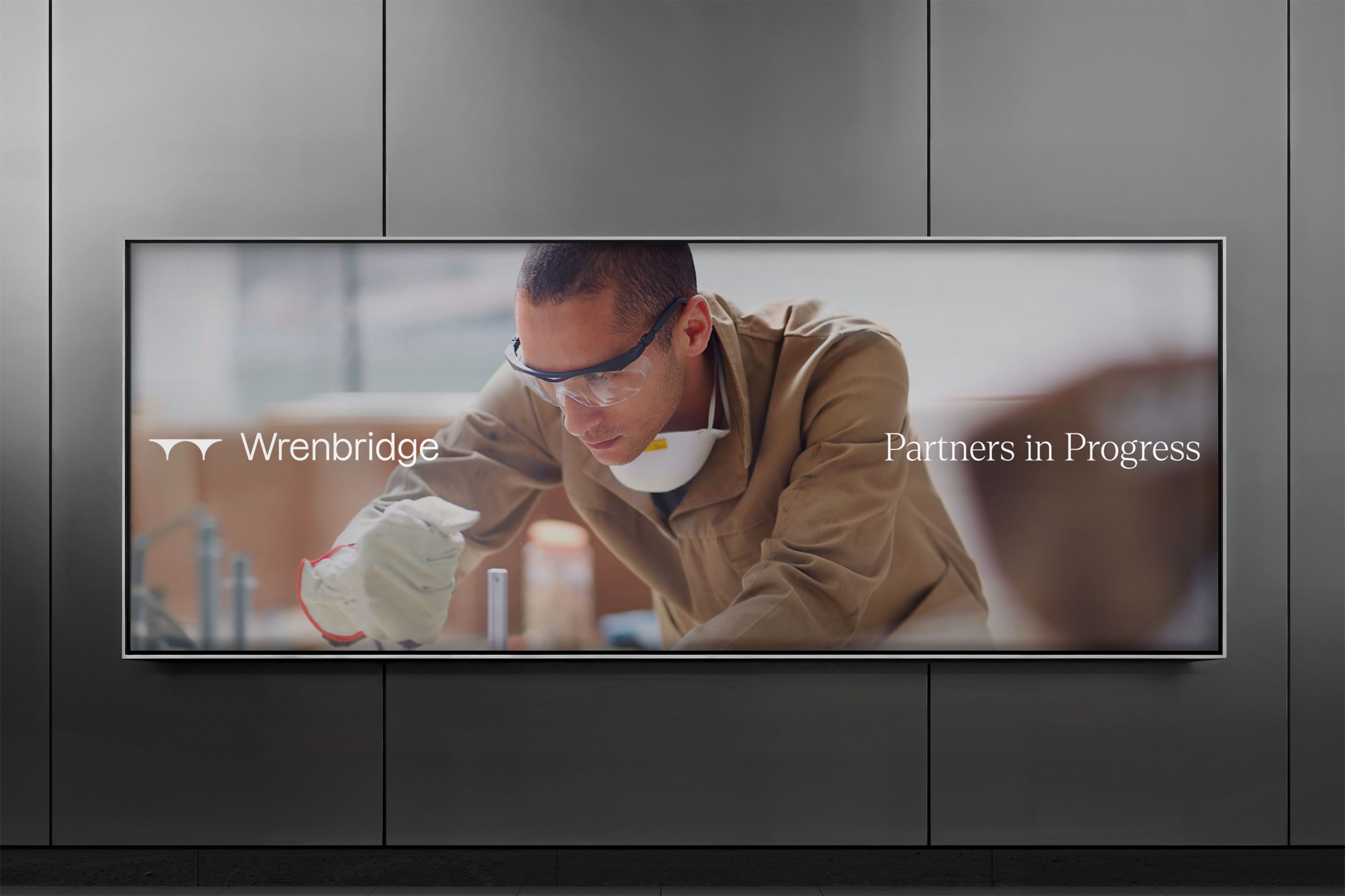
The brand’s art direction and copywriting place a stronger focus on the people-centred nature of Wrenbridge’s work, adding warmth and a human element to buildings and industrial environments.
To create a clear distinction from their affiliated brand, Wrenbridge Sport, we have incorporated a blue bar throughout the identity. In digital applications, this blue bar expands to reveal a second layer of information, adding depth and interactivity.
Related Projects Related Projects